ARock
Case STudy

Background

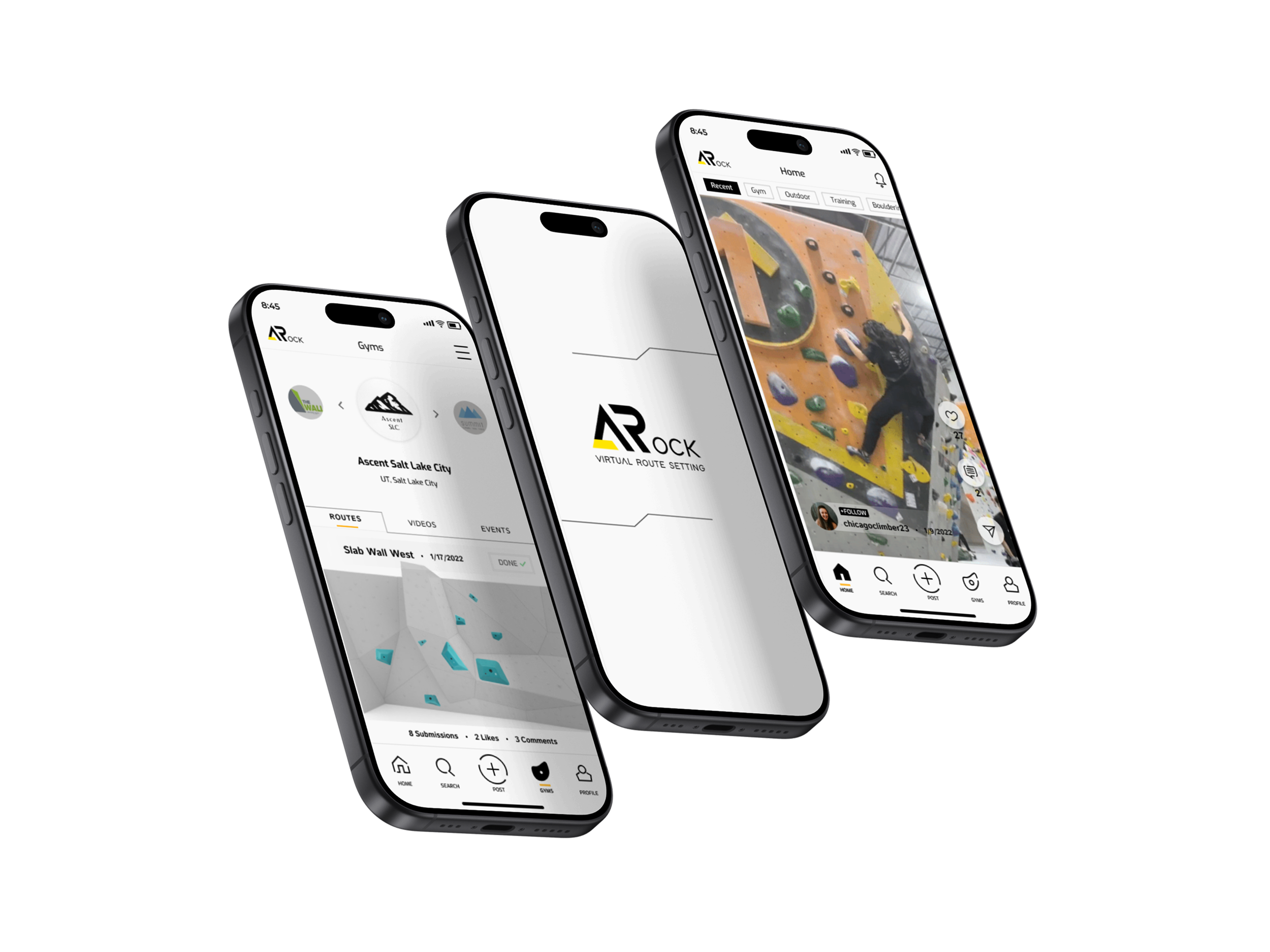
ARock is a new social media and virtual route setting app commissioned by a climbing gym. Climbing’s increased popularity has brought attention to the route setting that happens behind the scenes at all climbing gyms and competitions. Climbers are offered the opportunity to stir their creativity and give route setting a try. Become virtual route setters via the ARock app and submissions will be carefully reviewed by the team of professional in-house route setters.

Problem

It is common for climbers to be curious about route setting at their local gym. Route setting is a delicate profession that involves inherently dangerous tasks such as heavy lifting, working with industrial tools at high heights and potential for harm if not carefully executed. Inviting all climbers (members and non-members) to submit their routes via app makes it extremely accessible for anyone who is interested in route setting from the safety of their mobile phones.

Challenge

Design a mobile app catered to helping build communication between gym owners, route setters and the climbing community. We are also developing an AR route setting feature that allows anyone in the climbing community to challenge their creativity by creating routes with this app that will be reviewed and potentially selected to be physically set in the gym for everyone to climb.

project

End-to-End Mobile App

Role

UX/UI Designer

Duration

100+ Hours

Tools

Figma, Maze.co
View Prototype

01

Research

In this end-to-end application design, the project began with a combined passion for design and rock climbing. This application was designed with the goal of improving communication within the climbing community in mind; from gym owners to route setters to including all members of the climbing community. During the initial phase, I first begin to research users wants and needs in a modern climbing social media application.

User Interviews

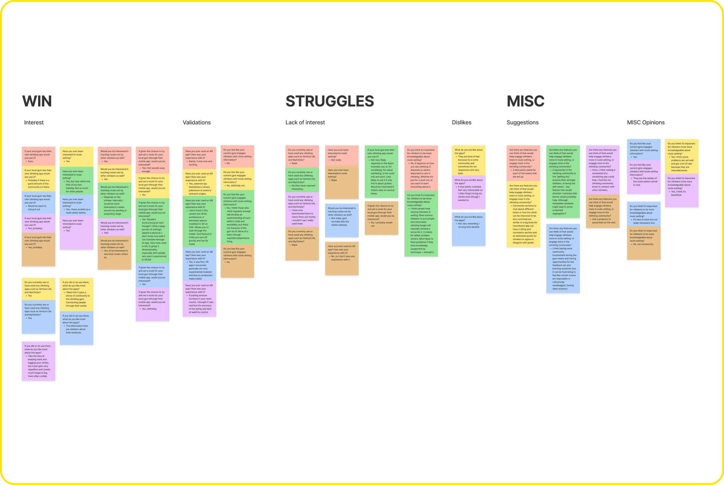
The first round of research consisted of gathering thoughts and opinions from climbers about route setting, their experience with existing climbing apps, and their experience with using AR apps. After interviewing several climbers of different backgrounds and levels, I discovered there was a genuine interest in the virtual route setting if climbers route entries had a chance of getting set in the gym. Opinions on the idea of using climbing apps and AR apps in general were quite varied and not as enthusiastic, but I have a compiled list of likes and dislikes from the climbers that can point the design of this app in a clearer direction.

Follow-Up Survey

After some mixed feedback and generally broader answers from the user interviews, a follow-up survey was conducted to help clarify some more specific points that needed to be addressed. I wanted to pinpoint and narrow down specific features climbers may want to see in a climbing social media app.

Findings

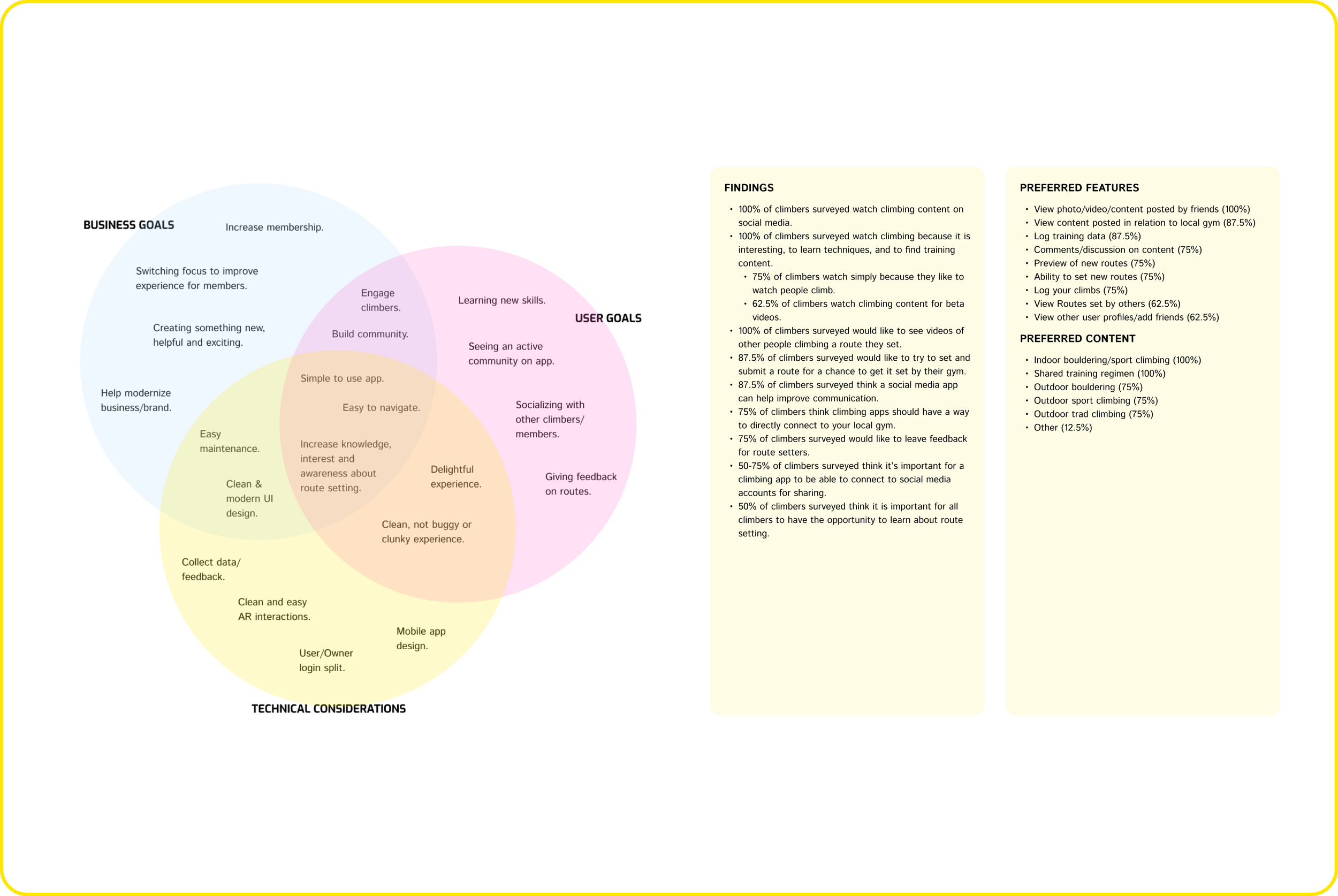
  • 100% of climbers surveyed watch climbing content on social media.
  • 100% of climbers surveyed watch climbing because it is interesting, to learn techniques, and to find training content.
  • 75% of climbers watch simply because they like to watch people climb.
  • 62.5% of climbers watch climbing content for beta videos.
  • 100% of climbers surveyed would like to see videos of other people climbing a route they set.
  • 87.5% of climbers surveyed would like to try to set and submit a route for a chance to get it set by their gym.
  • 87.5% of climbers surveyed think a social media app can help improve communication.
  • 75% of climbers think climbing apps should have a way to directly connect to your local gym.
  • 75% of climbers surveyed would like to leave feedback for route setters.
  • 50-75% of climbers surveyed think it’s important for a climbing app to be able to connect to social media accounts for sharing.
  • 50% of climbers surveyed think it is important for all climbers to have the opportunity to learn about route setting.

Preferred Features

  • View photo/video/content posted by friends (100%)
  • View content posted in relation to local gym (87.5%)
  • Log training data (87.5%)
  • Comments/discussion on content (75%)
  • Preview of new routes (75%)
  • Ability to set new routes (75%)
  • Log your climbs (75%)
  • View Routes set by others (62.5%)
  • View other user profiles/add friends (62.5%)

Preferred Content

  • Indoor bouldering/sport climbing (100%)
  • Shared training regimen (100%)
  • Outdoor bouldering (75%)
  • Outdoor sport climbing (75%)
  • Outdoor trad climbing (75%)
  • Other (12.5%)
These findings helped narrow down features that climbers are looking for in a climbing social media app. The data suggests that users prefer to see a variety of climbing content and helped validate the point that many climbers show interest in the ability to virtually set a route for their local gym if they have a chance to get it set by the route setters. It also validates interest the climbing community has in finding climbing content via social media apps and the idea that a social media app for the local gym can help improve communication between gym owners, route setters, and climbers.

Project Goals

Based on the research findings, the project goals have been narrowed down and there is heavier emphasis placed on building community, improving communication, sharing content and knowledge. We want to create a delightful, clean, and easy to use experience for climbers that will hopefully encourage users to continue using the app. Through creating a climbers social media platform, and  introducing a new feature that allows users to submit routes to their local gym for review, we believe communication will be improved between all parties.

02

Define

After gathering data, I turn my attention to focus on how ARock can achieve an experience that easily reflects it’s project goals. To hone in on a design for this experience, the next step is to create the primary target users who will be using the ARock app. Through creating user personas for both the average climber in the community and for a route setter who will be on the other end of the app, I am able to observe how these two personas will interact and gain a deeper sense of empathy for both sides.

User Persona

Everyday Climber

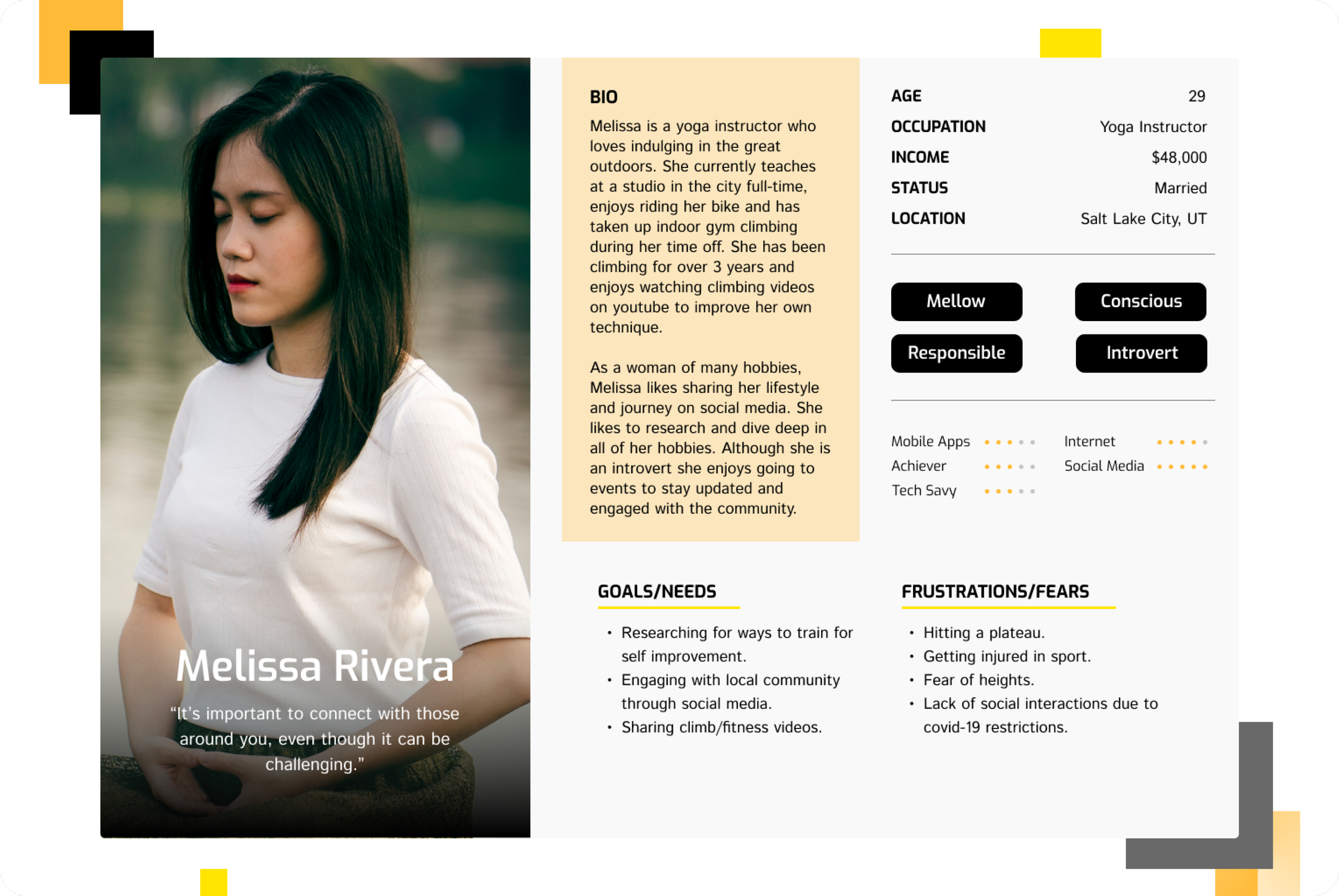
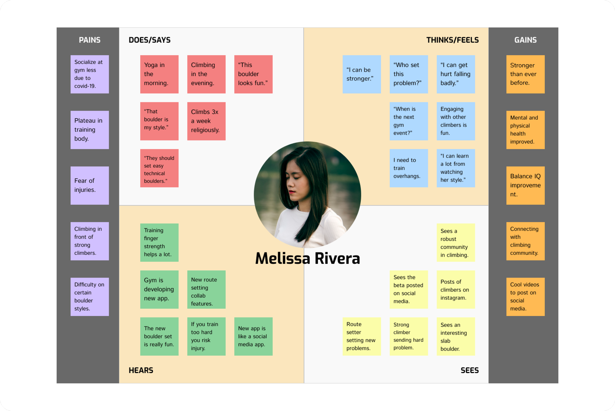
Melissa is our primary user persona; the everyday  climber who frequents the gym and will likely be downloading ARock app to help her keep in touch with fellow climbers and gym updates. I keep her thoughts and frustrations in mind when approaching how to design the social media and route setting functions.

User Persona

Route Setter

Our second user persona Joe, has been setting at the local climbing gym for years. I empathize with how he will be a main communicator between the gym and the community, receiving countless route setting submissions to review, and what his thoughts and actions will be on the new app.

Empathy Map

For this MVP, our main focus will be the experience surrounding our everyday climber Melissa. As a climber who frequently browses social media apps, understanding what Melissa thinks and how she navigates the gym and social media apps gave me ideas on how to approach designing functions to share media content and also increase interactivity between climbers and their gym.

03

Design

Before getting into the nitty gritty of our visual design, I take a step back and think about the strategy of ARock. The flow of the user’s task is created to help visualize how Melissa will navigate ARock, giving me specific direction on what screens are needed for our MVP. After building out the foundational map and structure, wireframes and design system elements are sketched and brainstormed for the prototype.

Site Map

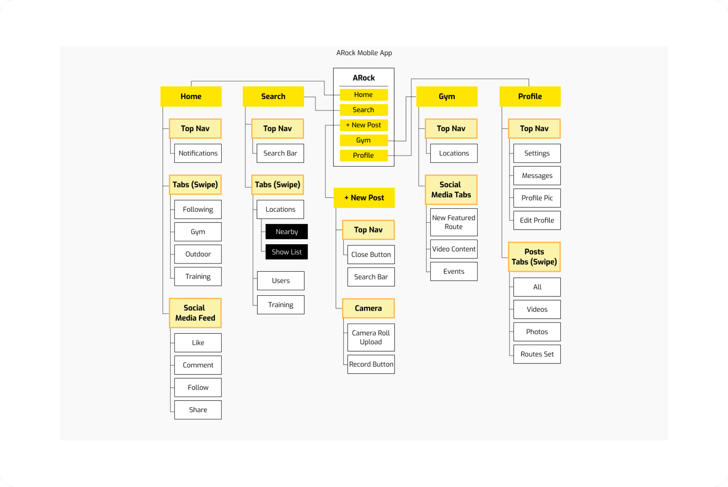
The site map of ARock firstly references common design patterns of current social media apps. Including pages such as Home, Search and Profile will give our everyday social media users a sense of familiarity and increase the ease of use and navigation. Including a page for our local Gym on the main navigation signifies it’s importance and hopefully will pique the curiosity of our climbers.

Task Flow

There are two specific tasks designed for Melissa. The first task of posting content on social media will hopefully give her a sense of familiarity to explore other parts of ARock with less hesitation and more confidence. The second task will be slightly more challenging since that is the nature of navigating any virtual space. For the sake of testing the ease of use, this prototype will not tackle navigation of virtual space, but is designed to test user’s response to the task flow.

Sketches

After weeks of research and ideation, the first step in creating visual identity for ARock begins with rough sketches of as many screen layouts as possible. This brainstorming process involves research and referencing pre-existing social media screens for good design patterns that will fit with ARock.

Low-Fidelity Wireframes

From the many variations of sketches, I choose the ones that fit ARock best based on aesthetic and function to be included. These next step sketches act as low-fidelity wireframes that help to mock up our user’s experience.

Style Tile

To keep our visual design clean and bright, I chose to use a color palette that leans heavy on white backgrounds; reminiscent of indoor climbing walls, with pops of bold bright yellows and oranges to accentuate. To give the app a modern tech edge (in association with futuristic virtual space), the fonts chosen lean toward sharper and angular san serifs, along angular buttons and icons to match.

High-Fidelity Wireframes

All the visual design elements presented in the style tile such as logos, icons, typography, color palettes and overall mood are applied to the low-fidelity wireframes which then in turn become high-fidelity wireframes, ready for prototyping. In this step, the ideas, research and strategy behind ARock finally comes to life.

04

Testing

After research, strategy and designing ARock, the first prototype is chained together, ready to be put into hands of users for testing. The goal of the first round of usability testing is to find any pain points that users encounter while executing the assigned tasks. This step gave me insight on where I can make improvements.

Prototype & Usability Testing

For the first round of usability tests, remote testing via maze.co was utilized for quicker outcomes due to time constraints and limited in-person testing due to covid-19 restrictions. I chose to streamline my wireframing and prototyping process by using Figma for both, allowing for a smooth feedback and iteration process after testing.
View Prototype

Affinity Map

The results from usability testing validated the simplicity and ease of use of task #1 where the users were assigned the familiar task of posting social media content.

Task #2 caused some friction due to confusion in wording of the testing instructions. With maze’s limited capabilities to change or restructure testing instructions while testing is in session, I was unable to correct the mistake until after collecting all my expected tester’s results.

Priority Matrix

With the data collected, then affinitized, I arranged the most notable pain points and causes of confusion in a matrix to prioritize what changes could be made with the given time left.

After collecting this data, the changes that were high priority and low effort were implemented in the second iteration of the prototype.

05

Reflection

In the end, the MVP for the first iteration of ARock was a success. The feedback from the usability testing helped validate that the assigned task flows were fairly clear, and confusion came from wording of usability testing instructions, which I will definitely revise and overlook more strategically.

NEXT STEPS:

  • The changes from our priority matrix will be made in the second iteration of this prototype.
  • Another round of testing with better instructions would be helpful in discovering more key thoughts surrounding the virtual route setting feature in task #2.

DO OVER:

  • If there were any changes to my steps in this project, I would choose to implement a more fleshed out design system, which would help with making small changes such as color and text styles easy to change in one place.

What I Learned

During the early stages of the ARock app, I discovered the importance of time management and the difficulties it brings when working on a project of larger scales. My initial goal was to create an MVP for both user personas but due to time constraints and resources, creating task flows for both would not be possible with the given time. This project made me think deeply about user centric design for an app that would ultimately have multiple different users types such as gym owners, route setters, and climbers.
^ Back to Top
View Next Case Study ›